I got back late Sunday night from my college reunion, which provided both conversation late into the three nights I was there, and an afternoon visit to the Yale University Art Gallery. I took a lot of it in, and the following three details from three very different paintings made a particular impact. They’re also good examples of how I find I’m often more interested in “sound in art” than in “sound art.”
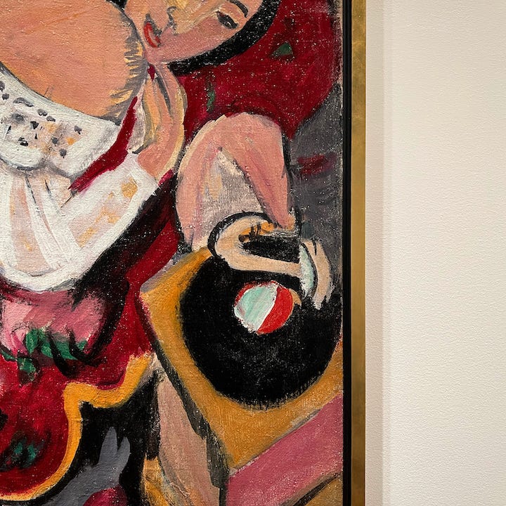
Not long after staring at the textural details of a 4,000-year-old Sumerian votive statue hewn from limestone, I found myself on a different floor, drawn from across the room to a familiar shape in the corner of a painting from merely 110(ish) years ago: this turntable, in the bottom right quadrant of a much larger oil painting, Girl in White Chemise, by German artist Ernst Ludwig Kirchner (1880-1938). (That gold vertical line is the edge of the frame. To the right is simply the gallery wall.) I want to understand how “modern” this object read to a viewer at the time, and whether the record label’s red and white coloring was easily identifiable. I was struck by the flesh color of the tone arm, and the way its seductive shape emulated that of the reclining woman.
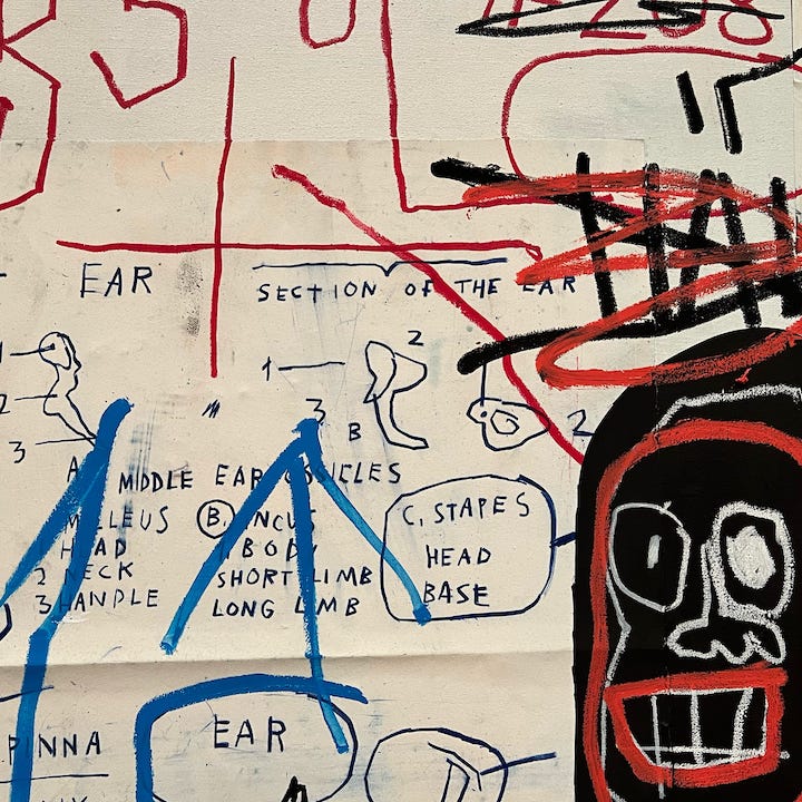
This element was a reminder of just how much sound there is in the work of New York native Jean-Michel Basquiat (1960-1988). The larger piece is titled Diagram of the Ankle, from 1982. There is something jittery about the desire to scribble the receptive mechanisms of human hearing, a will to comprehend. This material shown here is a subset of half of a diptych, its background a cream color, adjacent to the other portion’s black, the latter of which features a visually loud, all-caps “WOOFS” next to the faces of some wild-looking dogs — perhaps the very sounds that this anatomical equipment is processing.
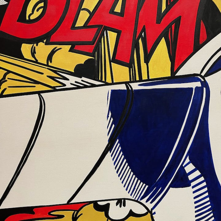
I was confronted by the intense graphic sensibility of another New York native, Roy Lichtenstein (1923-1997). The instant I took this photo, I was faced with the shortcomings of its resulting depiction of the piece’s surface, even when I zoomed in. Then I recalled that I spend too much time thinking about a central irony of Lichtenstein’s work: reproduction doesn’t begin to do it justice. This is from the onomatopoeically named Blam, from 1962. It’s funny to think that one common trope in the description of Lichtenstein’s work is that he “elevates” his source material, in this case a panel from a comic of the same year by artist Russ Heath (1926-2018). It’s arguable that Lichtenstein’s take is, in fact, more cartoony, not less, than the Heath original, which has more doom-laden colors and a far less abstract explosion. And as for “BLAM” itself, it is softer and more rounded in Lichtenstein’s rendering.